How to Create an Organizational Chart in Google Docs
In today's fast-paced business environment, understanding your company's structure is crucial for success. At the heart of this understanding lies the organizational chart - a powerful visual tool that does more than map reporting relationships.
Why Organizational Charts Matter
Think of an organizational chart as your company's GPS - it helps everyone navigate the complex landscape of roles, responsibilities, and relationships within your organization. These visual frameworks have evolved from static hierarchies into dynamic tools that capture the essence of modern business operations.
The Power of Visual Organization
Today's businesses thrive on flexibility and interconnection. A well-designed organizational chart reflects this reality by serving multiple critical functions:
- Clear Reporting Structure: Maps direct supervisory relationships and accountability chains
- Team Integration: Shows how various departments connect and collaborate
- Talent Mapping: Identifies concentrations of expertise and capabilities
- Career Development: Illustrates potential growth paths and advancement opportunities
Organizations that maintain clear structural visibility typically see enhanced operational efficiency and stronger employee satisfaction levels.
Best Practices for Effective Organizational Charts
-
Clarity is King
- Use clean, readable layouts
- Minimize visual clutter
- Maintain consistent formatting
-
Strategic Information Presentation
- Balance detail with high-level overview
- Use color coding strategically
- Include key metadata without overwhelming
-
Regular Maintenance
- Review and update quarterly
- Sync with communication tools or HR systems
- Reflect organizational changes promptly
Two Approaches to Creating Org Charts in Google Docs
When it comes to creating organizational charts in Google Docs, you have two main options:
-
Using the Drawing Tool: A built-in feature that allows you to create basic org charts directly within Google Docs. This method is best for simple hierarchies and quick visualizations.
-
Using Google Sheets Integration: You can create and maintain your org chart data in Google Sheets, then generate a dynamic visualization that automatically updates when the source data changes. This approach works well for larger organizations that need to frequently update their structure.
1. Step-by-Step Org Chart Creation with Google Docs Drawing Tool
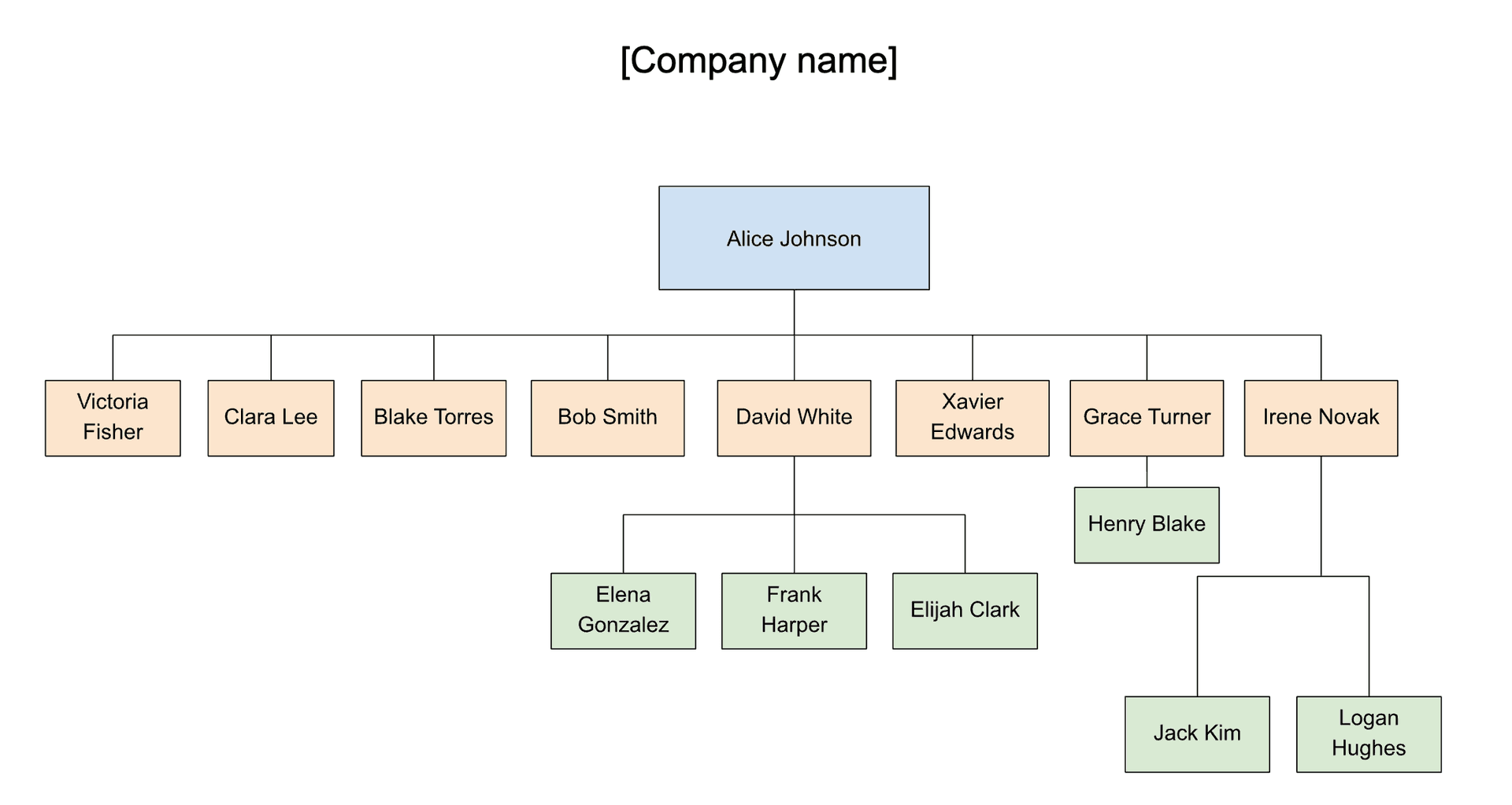
Let's walk through creating a professional organizational chart in Google Docs, step by step. By the end of this guide, you'll be able to create something like this:
1.1 Create and Set Up Your Document
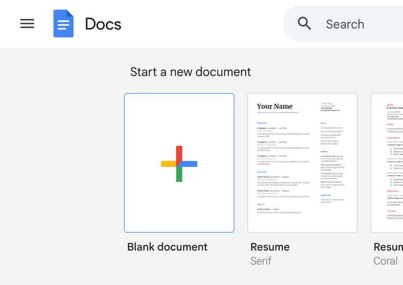
Start by opening Google Docs (https://docs.google.com/ or https://docs.new) and creating a new blank document.
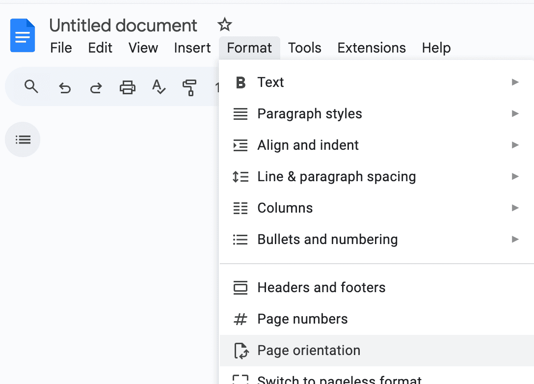
Since org charts are typically wide, consider switching to landscape orientation:
- Click on the File menu option
- Find the Page setup option
- Select "Landscape" under the Orientation section
1.2 Insert a new Drawing
- Click the Insert tab
- Select Drawing and New
This will open a general drawing tool where you can create your org chart.
1.3 Build your Org Chart
Now that you're in the drawing tool, you can start building your organizational chart:
-
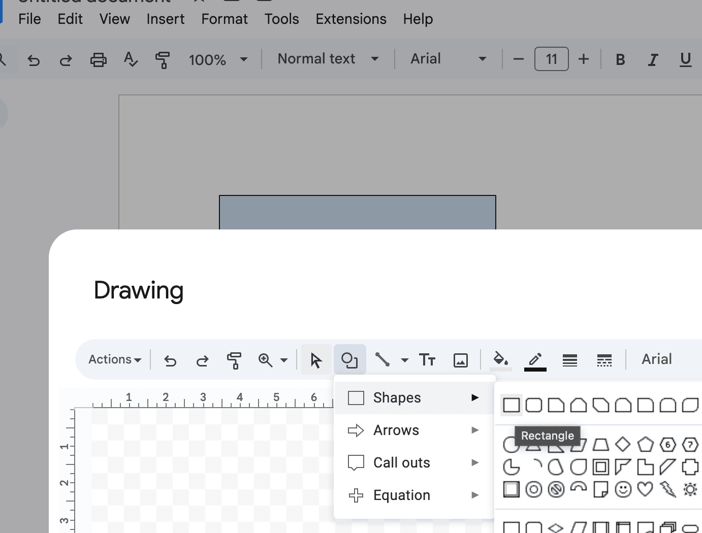
Use the Shape tool to add boxes for each position
- Click the Shape icon in the toolbar
- Select rectangles or rounded rectangles for roles
- Click and drag to draw each box
- Add text by clicking inside the shape
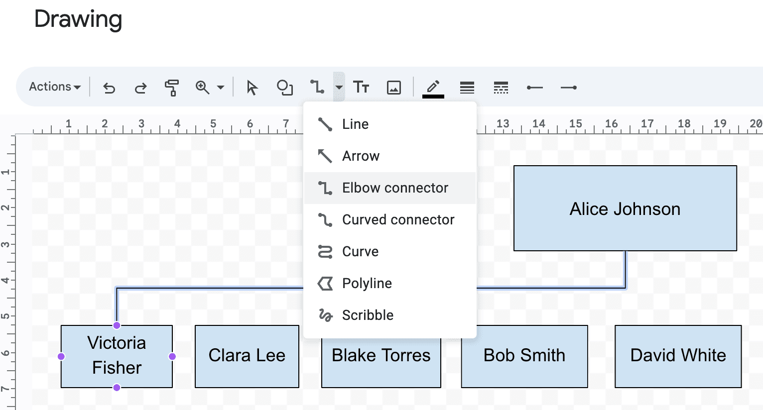
- Connect positions with lines
- Select the Line tool
- Choose "Elbow Connector" for professional-looking connections
- Click the purple dot on the source shape
- Drag to the purple dot on the target shape
- The line will automatically connect and adjust when shapes move
1.4 Customize the org chart
Once you have the basic structure in place, take time to customize your org chart to make it more visually appealing and professional:
-
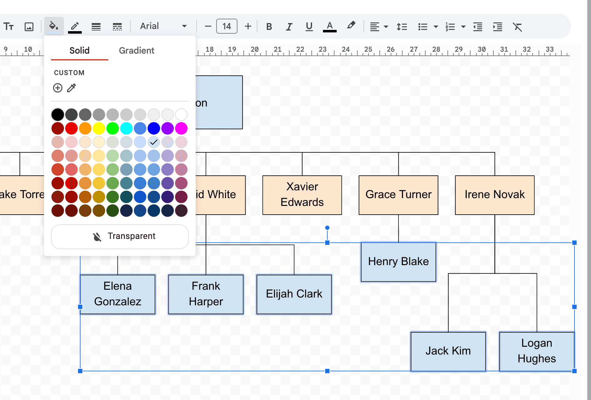
Style your shapes
- Select shapes and use the Fill color tool to add corporate colors
- Adjust border thickness and style for better visibility
- Use consistent colors for similar hierarchical levels
-
Format your text
- Choose appropriate fonts and sizes for different levels
- Bold titles and key positions
- Align text consistently within shapes
- Consider using different text colors for clarity
-
Adjust spacing and alignment
- Use the grid feature to ensure shapes are properly aligned
- Maintain consistent spacing between levels
- Resize shapes to accommodate longer titles or additional information
-
Add visual elements
- Consider using different shapes for different roles
- Include company logos or department icons
- Use color coding to distinguish departments or divisions
Keep your design consistent and clean. Too many colors or fonts can make your org chart harder to read and less professional.
1.5 Additional Options
Once you've created your org chart, it's important to know how to save and maintain it effectively:
To maximize visible space for your org chart, adjust page margins: File → Page Setup → Margins → Set all margins to 0.5 inches or less.
To modify your org chart after creating it:
- Double click anywhere on the drawing to reopen the editor
- Make your desired changes:
- Add or remove positions
- Adjust colors and formatting
- Update text or titles
- Modify connecting lines
- Click "Save and Close" when finished
The drawing will remain editable as long as you have edit access to the document. This makes it easy to keep your org chart up-to-date as your organization evolves.
1.6 Downloadable Google Docs template with manual drawing
Open in Google DocsTo generate a copy, click on "File" and then select "Make a copy"
While the drawing tools in Google Docs can work well for simple organizational structures, they become increasingly difficult to manage as your organization grows. Some common challenges include:
- Time-consuming manual updates when positions change
- Limited space for larger hierarchies
- Difficulty maintaining consistent formatting
This is where Google Sheets offers a more powerful alternative. With its built-in organizational chart feature and spreadsheet capabilities, Google Sheets provides a more scalable and maintainable solution for creating professional org charts. Let's explore how to leverage these advanced features.
2. Step-by-Step Google Docs Org Chart Creation with Google Sheets Embed
Google Sheets offers a more scalable approach to creating organizational charts, especially when working with larger teams or frequently changing structures.
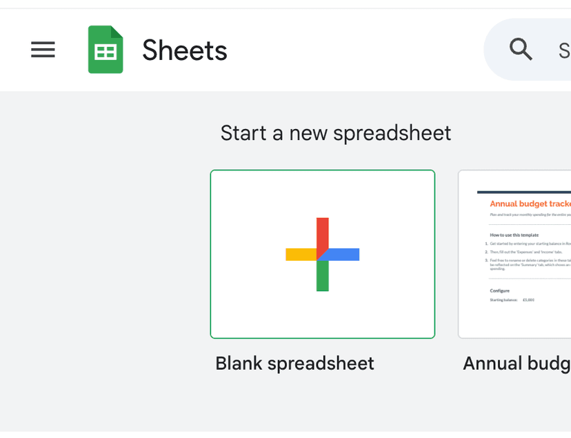
2.1 Create a new Google Sheets document
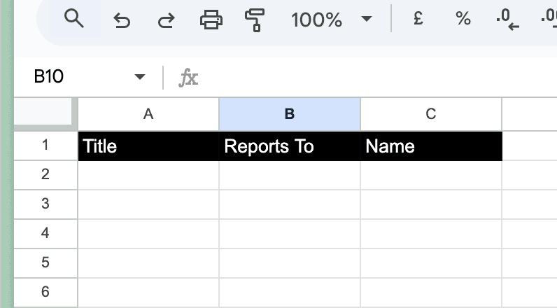
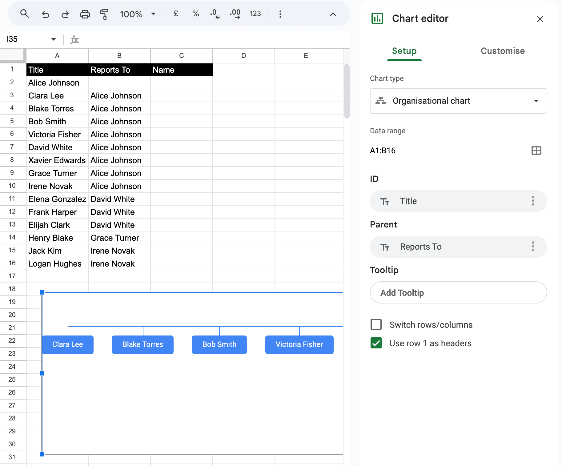
2.2 Add data columns with header (title, reports to)
Title will be used for the name of the employee as it's displayed in the org chart. Reports to will be used to link the employee to their manager.
2.3 Add data to the sheet and generate a chart
-
Add your organizational data to the sheet, making sure to:
- List each position/employee in the "Title" column
- Specify their manager in the "Reports to" column
- Leave the "Reports to" cell blank for the top position
-
Select all your data including headers
-
Click Insert → Chart
-
In the Chart editor sidebar:
- Select "Organisational" under Chart type
- Check "Use row 2 as headers" if you have titles in row 1
- Customize colors and styles as needed
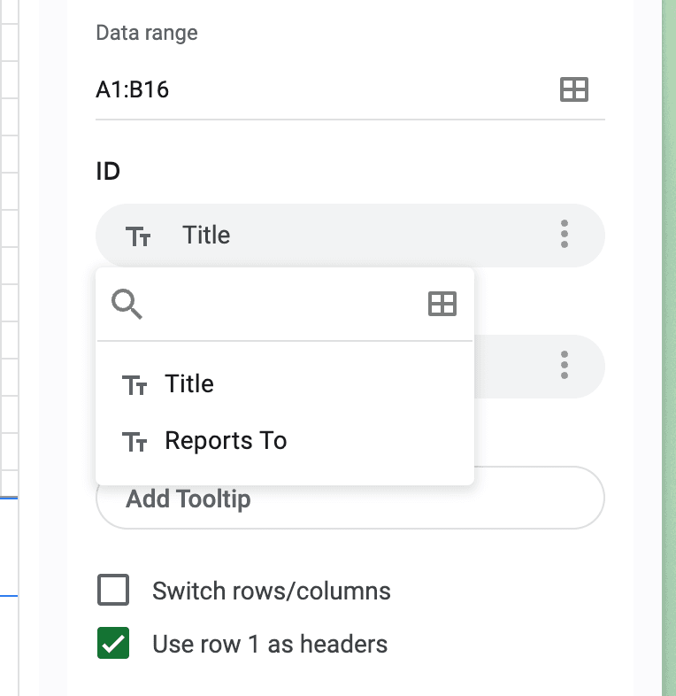
If your columns are in a different order, you can manually map them in the Chart editor sidebar:
- ID: Select your Title/Name column
- Parent: Select your Reports To column
- Tooltip: Optionally select a column for hover text
2.4 Embed the chart in Google Docs
Now that you have created your organizational chart in Google Sheets, you can embed it in your Google Docs document:
- Open your Google Docs document
- Click Insert → Chart → From Sheets
- Select your spreadsheet and the organizational chart
- Check "Link to spreadsheet" to keep the chart updated with source data
2.5 Export and share your org chart
-
Export your org chart:
- From Google Docs: Use the standard export function
- From Google Sheets: Click the three dots menu → Download Chart → Choose PDF (recommended) or PNG
- PDF format uses vector graphics for better quality output
-
Share your org chart:
- Publish the chart to URL for easy sharing with coworkers
- Access sharing settings through the three dots menu in Google Sheets
2.6 Downloadable Google Sheet template for embedding in Google Docs
Open in Google SheetsTo generate a copy, click on "File" and then select "Make a copy"
Understanding Limitations
While Google Docs is accessible and familiar, it has several key limitations compared to specialized organizational chart software:
- Limited Customization and Design Options
- Poor Scalability and Maintenance
- Lack of Dynamic Features and Integration
While Google Docs works well for small teams and basic hierarchies, organizations experiencing growth should consider specialized tools that can scale with their needs.
Choosing the Right Tool
We've created a tool that combines the best of Google Docs and Google Sheets to create a more powerful org chart tool.
Create org charts in minutes with Simple Org Chart
Build dynamic org charts that update automatically. Smart layouts and easy updates - without the limitations of traditional tools.
Looking for other ways to create your org chart?
Check out our step-by-step guides for popular applications.