How to Create an Organizational Chart in Google Slides
In today's dynamic workplace, having a clear view of your organization's structure is essential for effective operations. An organizational chart serves as more than just a hierarchy diagram - it's a strategic tool that visualizes how your company functions.
Why Organizational Charts Matter
An organizational chart acts as a blueprint of your company's structure, helping everyone understand where they fit and how different parts of the organization work together. Modern org charts have transformed from simple reporting trees into flexible tools that reflect today's collaborative work environment.
Benefits of Visual Organization
Effective organizational charts deliver several key advantages in modern business:
- Clear Accountability: Defines reporting lines and decision-making paths
- Cross-functional Collaboration: Visualizes how teams interact and work together
- Resource Planning: Shows distribution of skills and expertise
- Professional Growth: Outlines potential career progression paths
Companies with well-maintained organizational structures often experience better workflow efficiency and higher levels of employee engagement.
Creating Effective Organizational Charts
-
Focus on Simplicity
- Keep layouts intuitive and clean
- Remove unnecessary elements
- Use consistent design patterns
-
Smart Information Design
- Strike the right balance of detail
- Apply meaningful color schemes
- Include essential information only
-
Ongoing Updates
- Schedule regular reviews
- Integrate with company systems
- Keep current with organizational changes
Three Approaches to Creating Org Charts in Google Slides
When it comes to creating organizational charts in Google Slides, you have three main options:
-
Using the Shapes Tool: A built-in feature that allows you to create an org chart directly within Google Slides by manually adding shapes and connecting them with lines. This method works best for simple hierarchies and quick visualizations.
-
Using the Diagram Tool: Another built-in feature is the diagram tool within Google Slides. This method offers more flexibility, giving you additional options to customize and style your org chart from the start.
-
Using Google Sheets Integration: You can create and maintain your org chart data in Google Sheets, then generate a dynamic visualization that automatically updates when the source data changes. This approach is ideal for larger organizations that need to frequently update their structure.
Each method has its own advantages, so choose the one that best fits your needs:
- Start with the manual options (1 or 2) for simple org charts and quick visualizations
- Progress to Google Sheets integration (3) when you need automated updates and data-driven charts
- For advanced features like real-time collaboration and custom styling, explore our specialized org chart builder detailed at the end of this article
The key is selecting an approach that balances your immediate needs with potential future requirements as your organization grows.
1. Step-by-Step Org Chart Creation with Google Slides - Shapes Tool
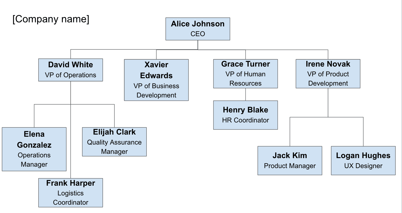
Let's walk through creating a professional organizational chart in Google Slides using the Shapes Tool, step by step. By the end of this guide, you'll be able to create something like this:
1.1 Create and Set Up Your Presentation
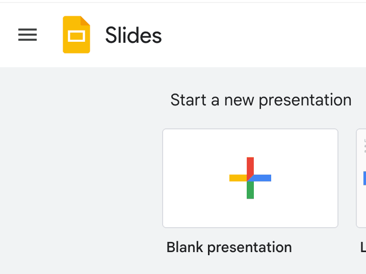
Start by opening Google Slides (https://slides.google.com/ or https://slides.new) and creating a new blank presentation.
1.2 Insert a new Shape
- Click the Insert tab
- Select Shape -> Shapes and the type of shape you want to add
- Place the shape on the slide and double click to add text

When adding shapes for your org chart, ensure a professional look by including both employee name and job title, formatting names in bold or larger font, adding line spacing between elements, and maintaining consistent text formatting across all shapes.
1.3 Connect shapes with lines
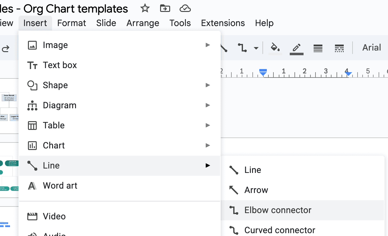
- Click the Insert tab
- Select Line -> Elbow Connectors
- Click on the purple dot of the source shape
- Drag the line to the purple dot of the target shape
- The line will automatically connect and adjust when shapes move
1.4 Customize the org chart
Once you have the basic structure in place, take time to customize your org chart to make it more visually appealing and professional:
-
Add your company branding
- Click File -> Insert -> Image to add your company logo
- Position the logo appropriately on the slide
- Consider adding a subtle background color that matches your brand
-
Customize shape styles
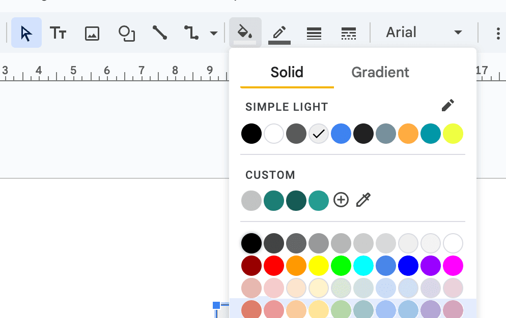
- Select shapes and use the Fill color tool to add corporate colors
- Try different gradients for visual depth
- Use consistent colors for similar hierarchical levels
- Adjust shape opacity for a more subtle look
-
Enhance line connectors
- Select connectors and adjust line weight for better visibility
- Change connector colors to match your design
- Fine-tune connector positions for clean alignment
- Consider using different line styles for different relationships
-
Perfect the layout
- Use the alignment tools to ensure shapes are properly aligned
- Maintain consistent spacing between levels
- Resize shapes as needed for uniformity
1.5 Export and Share Options
Google Slides offers several options for exporting and sharing your org chart:
-
Export as an image or PDF
- Go to File → Download
- Choose your preferred format:
- PNG image (best for web use)
- JPEG image (smaller file size)
- PDF document (best for printing)
- SVG vector image (scalable graphics)
-
Share a single slide
- Select File → Share
- Click "Copy link"
- Others can view or edit based on permissions
- Optionally restrict to specific slide with org chart
1.6 Downloadable Google Slides template with shapes and connectors (slide 1)
Open in Google SlidesTo generate a copy, click on "File" and then select "Make a copy"
There are two main ways to manually create an org chart in Google Slides: using shapes and connectors directly, or using the Insert > Diagram option. Let's explore the Insert > Diagram approach next.
2. Step-by-Step Org Chart Creation with Google Slides - Diagram Tool
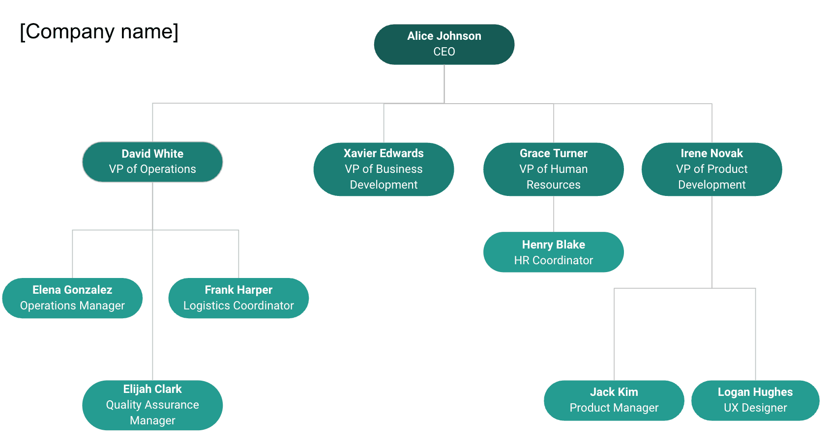
Let's walk through creating a professional organizational chart in Google Slides using the Diagram Tool, step by step. By the end of this guide, you'll be able to create something like this:
2.1 Create and Set Up Your Presentation
Start by opening Google Slides (https://slides.google.com/ or https://slides.new) and creating a new blank presentation.

2.2 Insert a new Diagram
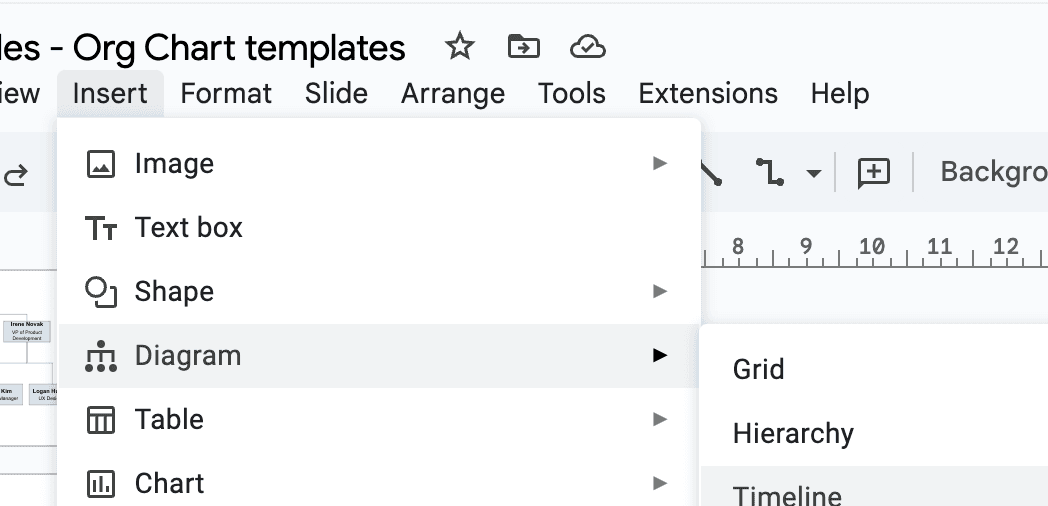
- Click the Insert tab
- Select Diagram -> Hierarchy
- Select the style of the diagram in the right panel
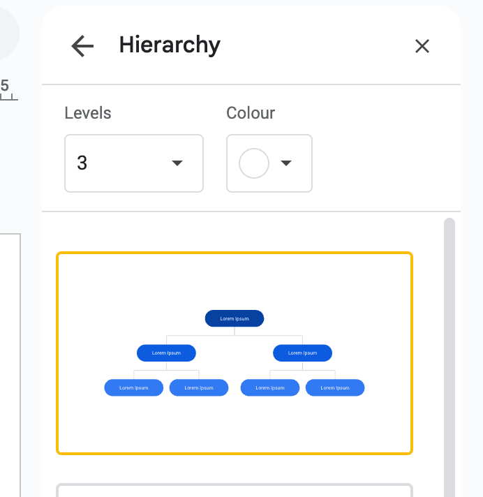
The diagram tool allows you to customize the number of hierarchical levels and color schemes. Click the diagram and use the right sidebar to adjust the number of levels, change colors for each level, and modify the overall layout to match your organizational structure and branding.
2.4 Customize the org chart
Once you've placed the diagram on the slide, you can customize your org chart to make it more visually appealing and professional:
-
Customize shape text content
- Double click any shape to edit the text
- Add employee names in bold or larger font
- Optional: Include job titles below names with smaller font
-
Copy and connect shapes
- Select the shapes you want to duplicate and press Ctrl+C (Windows) or Cmd+C (Mac)
- Press Ctrl+V (Windows) or Cmd+V (Mac) to paste the copied shapes
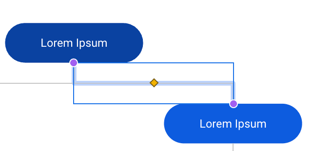
- Click Insert -> Line -> Elbow Connector to add connectors
- Click and drag from the purple dot on one shape to another to connect them
2.5 Export and Share Options
Google Slides offers several options for exporting and sharing your org chart:
-
Export as an image or PDF
- Go to File → Download
- Choose your preferred format:
- PNG image (best for web use)
- JPEG image (smaller file size)
- PDF document (best for printing)
- SVG vector image (scalable graphics)
-
Share a single slide
- Select File → Share
- Click "Copy link"
- Others can view or edit based on permissions
- Optionally restrict to specific slide with org chart
2.6 Downloadable Google Slides template with diagram (slide 2)
Open in Google SlidesTo generate a copy, click on "File" and then select "Make a copy"
Now that we've covered the diagram approach, let's explore how to create a more scalable org chart by connecting Google Slides with Google Sheets data for automatic generation and updates.
3. Step-by-Step Google Slides Org Chart Creation with Google Sheets Embed
Google Sheets offers a more scalable approach to creating organizational charts, especially when working with larger teams or frequently changing structures.

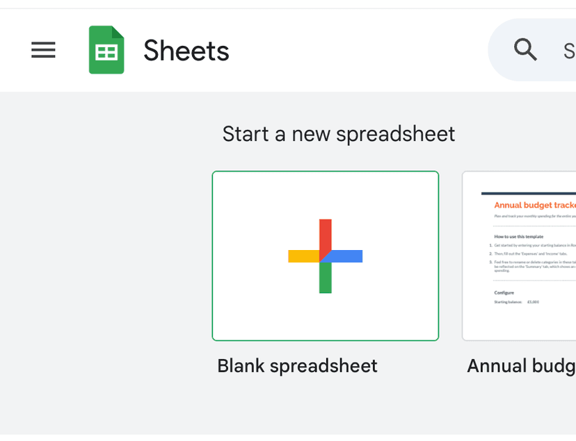
3.1 Create a new Google Sheets document
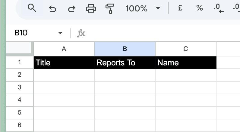
2.2 Add data columns with header (title, reports to)
Title will be used for the name of the employee as it's displayed in the org chart. Reports to will be used to link the employee to their manager.
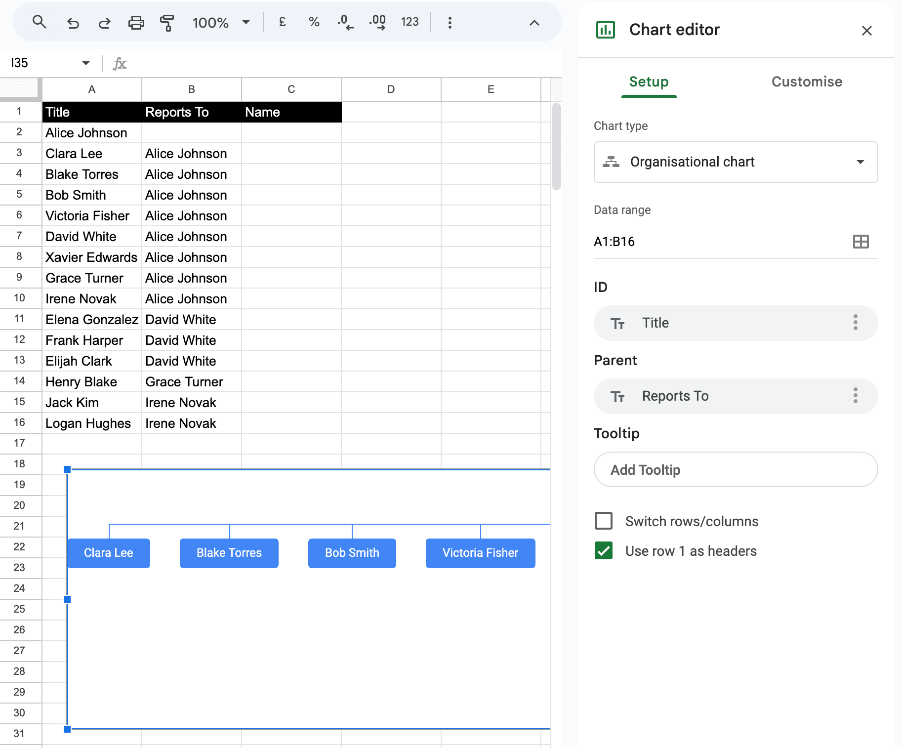
3.3 Add data to the sheet and generate a chart
-
Add your organizational data to the sheet, making sure to:
- List each position/employee in the "Title" column
- Specify their manager in the "Reports to" column
- Leave the "Reports to" cell blank for the top position
-
Select all your data including headers
-
Click Insert → Chart
-
In the Chart editor sidebar:
- Select "Organisational" under Chart type
- Check "Use row 2 as headers" if you have titles in row 1
- Customize colors and styles as needed
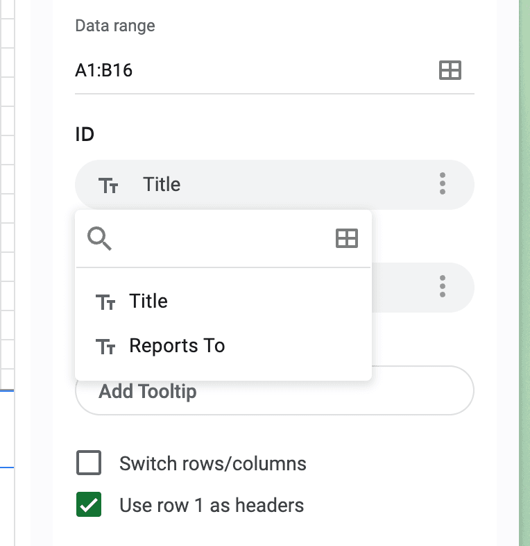
If your columns are in a different order, you can manually map them in the Chart editor sidebar:
- ID: Select your Title/Name column
- Parent: Select your Reports To column
- Tooltip: Optionally select a column for hover text
3.4 Embed the chart in Google Slides
Now that you have created your organizational chart in Google Sheets, you can embed it in your Google Slides document:
- Open your Google Slides presentation
- Click Insert → Chart → From Sheets
- Select your spreadsheet and the organizational chart
- Check "Link to spreadsheet" to keep the chart updated with source data
3.5 Export and share your org chart
-
Export your org chart:
- From Google Slides: Use the standard export function
- From Google Sheets: Click the three dots menu → Download Chart → Choose PDF (recommended) or PNG
- PDF format uses vector graphics for better quality output
-
Share your org chart:
- Publish the chart to URL for easy sharing with coworkers
- Access sharing settings through the three dots menu in Google Sheets
3.6 Downloadable Google Slides template with Google Sheets integration (slide 3)
Open in Google SlidesTo generate a copy, click on "File" and then select "Make a copy"
Now that we've covered all three approaches to creating org charts in Google Slides, let's explore some helpful tips for creating professional organizational charts and look at alternative org chart builders that can provide better features and quicker results for more complex organizational structures.
Understanding Limitations
While Google Slides is accessible and familiar, it has several key limitations compared to specialized organizational chart software:
- Limited Customization and Design Options
- Poor Scalability and Maintenance
- Lack of Dynamic Features and Integration
While Google Slides works well for small teams and basic hierarchies, organizations experiencing growth should consider specialized tools that can scale with their needs.
Choosing the Right Tool
We've created a tool that combines the best of Google Slides and Google Sheets to create a more powerful org chart tool.
Create org charts in minutes with Simple Org Chart
Build dynamic org charts that update automatically. Smart layouts and easy updates - without the limitations of traditional tools.
Looking for other ways to create your org chart?
Check out our step-by-step guides for popular applications.