How to Create an Organizational Chart in Google Sheets
In today's dynamic workplace, visualizing and understanding organizational structure is essential for business success. The organizational chart stands as a cornerstone tool, offering much more than a simple hierarchy diagram.
Why Organizational Charts Matter
Consider an organizational chart as your company's structural blueprint - it provides a clear view of how different roles, teams, and departments interconnect. Modern org charts have transformed from basic hierarchical diagrams into sophisticated tools that reflect the complexity of contemporary organizations.
The Impact of Visual Organization
Modern organizations require adaptability and cross-functional collaboration. An effective organizational chart captures these dynamics through several key benefits:
- Clear Accountability: Defines reporting lines and decision-making paths
- Cross-Team Collaboration: Visualizes how departments interact and work together
- Skills Distribution: Shows where specific expertise resides in the organization
- Professional Growth: Demonstrates potential career progression paths
Companies with transparent organizational structures often experience improved workflow efficiency and higher levels of employee engagement.
Best Practices for Organizational Chart Design
-
Prioritize Clarity
- Implement simple, intuitive layouts
- Remove unnecessary elements
- Keep styling consistent throughout
-
Smart Information Display
- Strike a balance between details and overview
- Apply purposeful color schemes
- Present essential information without overload
-
Consistent Updates
- Schedule quarterly reviews
- Maintain integration with HR systems
- Keep pace with organizational evolution
Two Approaches to Creating Org Charts in Google Sheets
When it comes to creating organizational charts in Google Sheets, we suggest two approaches using the built-in chart tool:
- Using the Chart tool with names as a tooltip: This method is the easiest one and shows the job titles in the shape and names as a tooltip.

- Using the Chart tool with combined names and titles: This method allows you to show job title and name combined in the shape.

1. Step-by-Step Org Chart Creation with Google Sheets - Tooltips
1.1 Create and Set Up Your Document
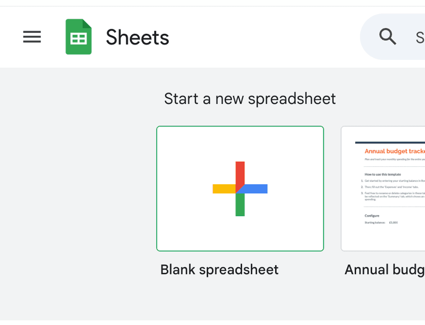
Start by opening Google Sheets (https://sheets.google.com/ or https://sheets.new) and creating a new blank spreadsheet.
1.2 Add header columns (Job Title, Reports To, Name)

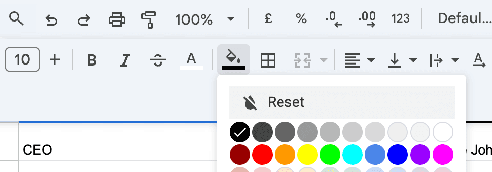
You can change the background and font color of the header cells to make them stand out:
- Select the header row
- Click the fill color icon to change background
- Click the text color icon to change font color
1.3 Fill in your data
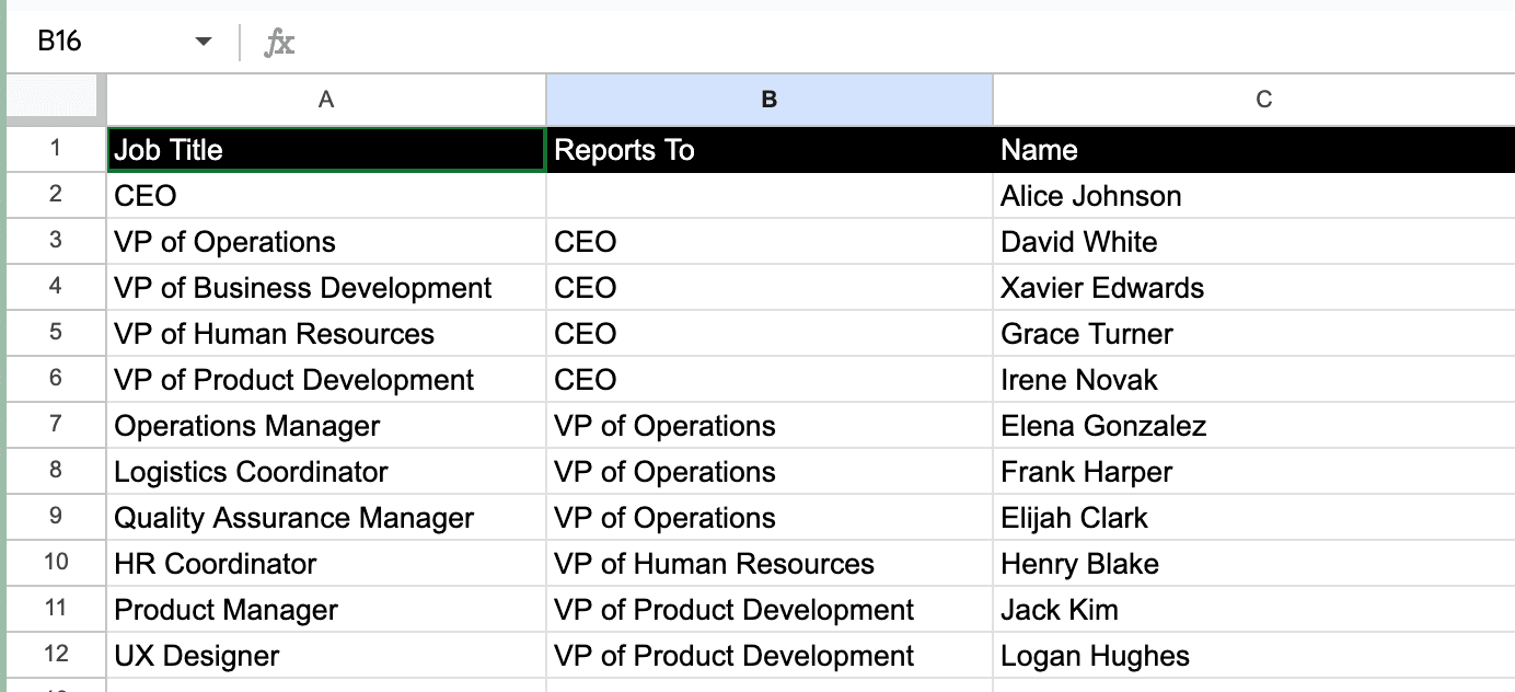
Enter your organizational data in the following format:
- Job Title column:
- Start with the top position (e.g., CEO)
- List all reporting positions (e.g., CTO, CFO, VP Sales)
- Include department heads and team members
- Reports To column:
- Leave blank for CEO (top position)
- For others, enter their manager's job title
- Ensure titles match exactly to create proper relationships
- Name column:
- Enter full name or email
- Keep format consistent throughout
1.4 Generate the org chart
Now it's time to generate your organizational chart:
- Select all your data including the header row
- Click Insert in the top menu
- Navigate to Chart from the dropdown menu
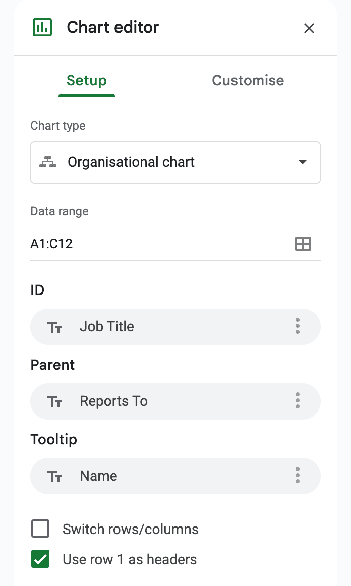
- In the Chart editor panel that appears:
- Under Chart type, scroll to find and select "Organisational chart"
- Make sure "Use Row 1 as headers" is checked
- The preview will update automatically to show your org chart structure
Your organizational chart will be generated based on the relationships defined in your data. The Job Title column determines the shapes, while the Reports To column creates the connecting lines showing hierarchical relationships.
For better usability, hovering over any shape in the chart will display a tooltip showing the person's name or email from your data.
1.5 Additional Options
You can further refine your chart using:
- The Setup tab to adjust basic chart properties
- The Customize tab to modify colors, fonts, and layout options
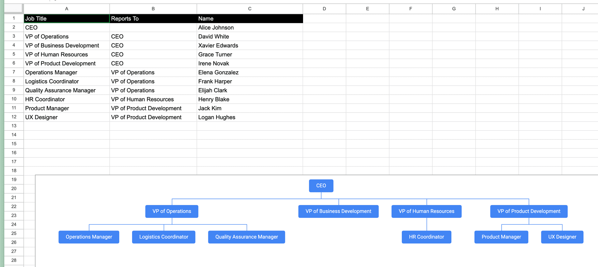
1.6 Downloadable Google Sheets template
Open in Google SheetsTo generate a copy, click on "File" and then select "Make a copy"
If you want to display more detailed information like both names and job titles in your org chart boxes, our second guide below will show you how to create a more comprehensive organizational chart in Google Sheets.
This advanced approach leverages Google Sheets' powerful features to create professional org charts that include full employee details while maintaining easy updates and scalability.
2. Step-by-Step Org Chart Creation with Google Sheets - Job Title + Names
2.1 Create and Set Up Your Document
Start by opening Google Sheets (https://sheets.google.com/ or https://sheets.new) and creating a new blank spreadsheet.

2.2 Add header columns (Job Title, Reports To, Name, Name and Title (auto-generated), Supervisor Name and Title)

You can change the background and font color of the header cells to make them stand out:
- Select the header row
- Click the fill color icon to change background
- Click the text color icon to change font color

2.3 Fill in your data
Enter your organizational data in the following format:
- Job Title column:
- Start with the top position (e.g., CEO)
- List all reporting positions (e.g., CTO, CFO, VP Sales)
- Include department heads and team members
- Reports To column:
- Leave blank for CEO (top position)
- For others, enter their manager's job title
- Ensure titles match exactly to create proper relationships
- Name column:
- Enter full name or email
- Keep format consistent throughout
- Name and Title (auto-generated):
The TEXTJOIN function combines text from multiple cells into a single cell. Let's break down each parameter:
For example:
=TEXTJOIN(CHAR(10),TRUE,A2,C2)
- CHAR(10) - This is the delimiter:
- Creates a line break between the joined text
- Makes the output more readable in the org chart
- TRUE - The ignore_empty parameter:
- Skips any empty cells when joining
- Prevents unnecessary blank lines
- X - First text to join:
- References the Job Title column
- Takes the position/role of the employee
- X - Second text to join:
- References the Name column
- Takes the employee's name or email
This formula creates a nicely formatted label for each box in the org chart, showing both the person's title and name on separate lines. The formula will automatically update if you change either the title or name in the source columns.
- Supervisor Name and Title:
For the Supervisor Name and Title column:
- Look up the supervisor's row using the "Reports To" value
- Copy the corresponding Name and Title value from that supervisor's row
- Right-click and select "Paste special" then "Paste values only" to avoid formula references
- This ensures each employee's box shows their supervisor's full details
For example:
- If an employee reports to "CTO", find the row where Job Title is "CTO"
- Copy that CTO's Name and Title value
- Paste as a value (not formula) into the employee's Supervisor Name and Title cell

This creates a clear connection between employees and their supervisors in the org chart visualization.
2.4 Generate the org chart
Now it's time to generate your organizational chart:
- Select the last two columns of your data including the header row (Name and Title (auto-generated), Supervisor Name and Title)
- Click Insert in the top menu
- Navigate to Chart from the dropdown menu
- In the Chart editor panel that appears:
- Under Chart type, scroll to find and select "Organisational chart"
- Make sure "Use Row 1 as headers" is checked
- The preview will update automatically to show your org chart structure
Your organizational chart will be generated based on the relationships defined in your data. Each shape will display both the job title and name of the employee from your auto-generated Name and Title column, while the Supervisor Name and Title column creates the connecting lines showing the hierarchical relationships between positions.
2.5 Additional Options
You can further refine your chart using:
- The Setup tab to adjust basic chart properties

- The Customize tab to modify colors, fonts, and layout options

2.6 Downloadable Google Sheets template
Open in Google SheetsTo generate a copy, click on "File" and then select "Make a copy"
Understanding Limitations
Although Google Sheets provides an accessible starting point for creating org charts, it comes with notable constraints when compared to dedicated organizational chart solutions:
- Restricted Design Flexibility and Styling Options
- Challenging to Scale and Update Over Time
- Missing Advanced Features and Integrations
For small teams and straightforward structures, Google Sheets can suffice. However, growing organizations should explore purpose-built tools that better accommodate expansion and complexity.
Choosing the Right Tool
We've created a tool that offers an alternative to Google Sheets to create a more powerful org chart tool.
Create org charts in minutes with Simple Org Chart
Build dynamic org charts that update automatically. Smart layouts and easy updates - without the limitations of traditional tools.
Looking for other ways to create your org chart?
Check out our step-by-step guides for popular applications.