How to Create an Org Chart in Excel + Free Templates
In the intricate world of modern business, organizational structure is more than just a hierarchical diagram—it's the blueprint of your company's operational DNA. An organizational chart serves as a critical communication tool, transforming complex workforce relationships into a clear, visual narrative that bridges communication gaps, supports strategic planning, and provides a comprehensive view of your company.
The Strategic Importance of Organizational Charts
Organizational charts are far more than simple administrative documents. They are living, breathing representations of your company's structure, communication pathways, and potential growth trajectories. Let's dive deep into why these visual tools have become indispensable in today's dynamic business landscape.
Understanding Organizational Complexity
Modern organizations are no longer rigid, top-down structures. They're complex, interconnected networks of talent, skills, and collaborative relationships. An effective organizational chart captures this complexity by:
- Visualizing Reporting Lines: Clearly demonstrating who reports to whom
- Mapping Interdepartmental Relationships: Showing how different teams and departments interact
- Identifying Skill Clusters: Highlighting areas of expertise and potential cross-functional collaboration
- Supporting Succession Planning: Providing a clear view of potential leadership pathways
Companies with transparent organizational structures experience faster decision-making processes and improved employee engagement.
The Evolution of Organizational Visualization
The journey of organizational charts reflects the broader transformation of workplace dynamics:
-
Pre-Digital Era (1900-1980):
- Hand-drawn organizational books
- Static, printed organizational hierarchies
- Limited updates and high maintenance cost
-
Early Digital Age (1980-2000):
- Spreadsheet-based organizational representations
- Basic graphic design tools
- Increased flexibility but still manually updated
-
Modern Digital Workplace (2000-Present):
- Dynamic, real-time organizational mapping
- AI-powered organizational design tools
- Integration with HR and management systems
Types of Organizational Charts
Different organizations require different structural approaches based on their size, industry, and operational needs. Here are the most common types of organizational charts:
-
Hierarchical (Traditional)
- Clear chain of command flowing top-down
- Well-defined reporting relationships
- Typical in large corporations and government agencies
- Promotes specialization and clear career paths
-
Functional
- Organized by business functions (Marketing, Finance, HR)
- Encourages deep expertise development
- Efficient resource allocation within departments
- Common in mid-sized companies and specialized firms
-
Flat (Horizontal)
- Minimal management layers
- Direct communication between employees and leadership
- Faster decision-making processes
- Popular in startups and creative industries
-
Matrix
- Employees report to multiple managers
- Project-based structure with functional oversight
- Promotes cross-functional collaboration
- Common in consulting and technology firms
-
Divisional
- Organized by product lines, regions, or markets
- Each division operates semi-autonomously
- Clear profit/loss responsibility
- Typical in multinational corporations
Choose your organizational structure based on your company's size, culture, and strategic goals. The right structure can significantly impact operational efficiency and employee satisfaction.
The functional organizational structure is one of the most widely used approaches, especially in mid-sized companies. Here's how it typically looks:
- CEO/Executive Leadership at the top
- Core Business Functions directly below, such as:
- Marketing & Sales
- Finance & Accounting
- Human Resources
- Operations
- Research & Development
- Specialized Teams within each function
- Individual Contributors reporting to their functional managers
Microsoft Excel: A Familiar Starting Point
Microsoft Excel has long been the go-to tool for many professionals creating organizational charts. Its ubiquity, ease of use, and integration with other Microsoft Office products make it an attractive option for businesses of all sizes.
Strengths of Using Excel for Org Charts
- Universal Accessibility: Installed on nearly every business computer
- No Additional Software Costs: Leverages existing Microsoft Office 365 licenses
- Familiar Interface: Most professionals already know how to use Excel
- Basic Customization Options: SmartArt feature provides rudimentary design capabilities
- Quick Prototyping: Ideal for initial organizational structure drafts
Limitations to Consider
Despite its widespread use, Microsoft Excel has significant limitations for creating organizational charts:
- Scalability Challenges: Struggles with large, complex organizational structures
- Limited Design Flexibility: Restricted customization options
- Performance Issues: Slow rendering of intricate charts
- Collaboration Constraints: No real-time editing or synchronization
- Static Nature: Difficult to maintain and update frequently
Comprehensive Guide to Creating Org Charts in Excel
Preparing Your Organizational Data
Before diving into chart creation, gather and organize your data:
-
Collect Accurate Information
- Full names
- Job titles
- Departments
- Reporting relationships
- Images (optional)
-
Verify Data Accuracy
- Cross-reference with HR records in your HRIS or employee directory
- Confirm reporting lines with department heads
- Ensure all positions are correctly represented
1. Step-by-Step Excel Org Chart Creation with SmartArt
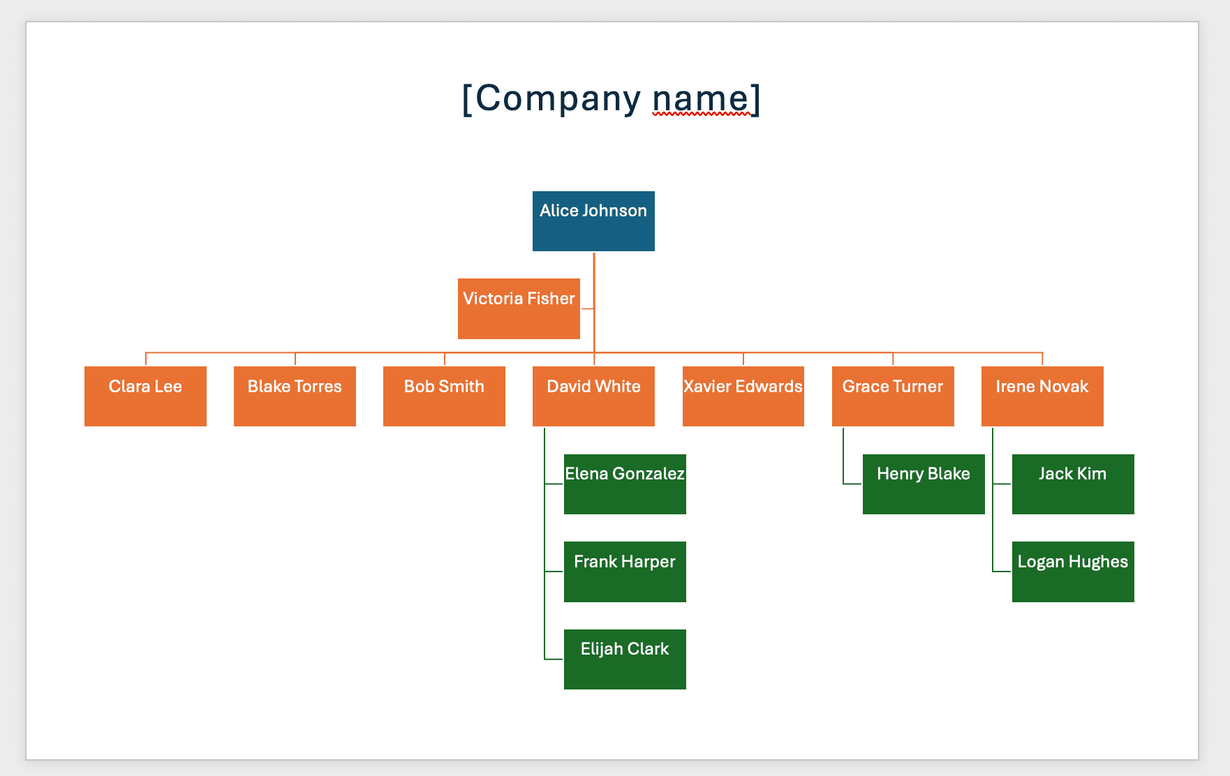
Let's walk through creating a professional organizational chart in Microsoft Excel, step by step. By the end of this guide, you'll be able to create something like this:
1.1 Create and Set Up Your Presentation
Start by opening Microsoft Excel and creating a new blank workbook.
1.2 Insert a SmartArt Org Chart
SmartArt is a built-in tool available in Microsoft Office products like Word, PowerPoint, and Excel for creating professional diagrams and visualizations. It provides:
- Pre-designed layouts for org charts and other diagrams
- Easy customization options for colors and styles
- Automatic formatting and alignment
- Simple drag-and-drop editing
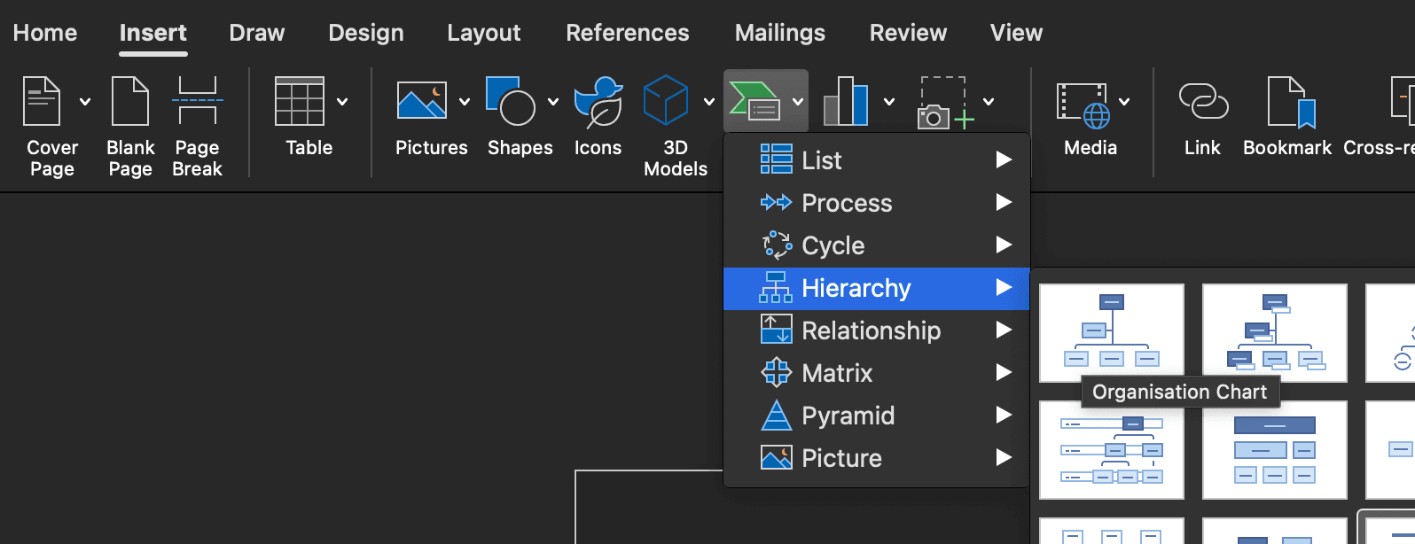
- Click the Insert tab
- Select SmartArt (look for the green diagram icon)
- Choose from two main options:
- "Organization Chart" - For a basic hierarchy view
- "Name and Title Organization Chart" - To display both names and positions
1.3 Modify the Organization Structure
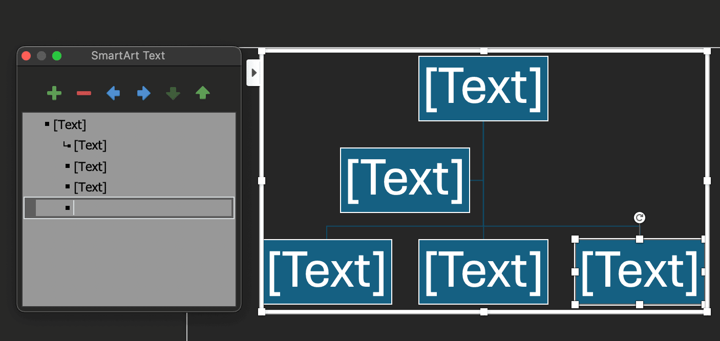
The default org chart includes sample data displayed in a nested structure within the SmartArt Panel.
When building your org chart, you have several approaches:
- Top-down: Start with executives (CEO, CFO) and work downward - best for traditional hierarchies
- Bottom-up: Begin with teams and work upward - useful when mapping existing structures
- Division-based: Create separate charts per department first, then connect them
We recommend the top-down approach for most organizations as it:
- Provides clearer visualization of reporting lines
- Makes it easier to maintain consistent formatting
- Helps identify gaps in leadership roles
Use the SmartArt Panel controls to:
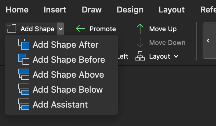
- Add new positions: Click the "Add Shape" button to insert new roles above, below, or at the same level as existing positions
- Delete positions: Select any position and press Delete or use the "Delete" button to remove it and automatically adjust relationships
- Promote/demote employees: Use the left/right arrow buttons to change reporting levels - left arrow promotes (moves up), right arrow demotes (moves down)
- Adjust reporting relationships: Drag positions to new managers or use the level buttons to restructure the reporting hierarchy
1.4 Add Assistant Positions
Assistant positions are useful for roles like Executive Assistants or Administrative Assistants who support leadership but don't fit into the traditional hierarchical structure. These positions typically have a unique reporting relationship where they work closely with executives while potentially having different formal reporting lines.
Here's how to add them:
- Select the manager's position
- Click "Add Shape" in the SmartArt Design panel
- Choose "Add Assistant"
1.5 Export Options
Exporting your org chart serves several important purposes:
- Documentation & Record Keeping: Preserve organizational structure snapshots for historical reference and compliance
- Sharing with Stakeholders: Distribute to board members, investors, or during due diligence processes
- Employee Onboarding: Help new hires understand the company structure and reporting relationships
- Print Distribution: Create physical copies for office display or handouts during meetings
Common export formats include:
- PDF Export: Click File tab → Click Save As → Select "PDF" from the "Save as type" dropdown → Click Save
Before exporting, resize your org chart to be no wider than 5 columns to ensure it fits nicely on a single page. This makes the chart more readable and professional when shared with others.
- Image Export: Export to PDF first, then use online tools like Adobe Acrobat Online, SmallPDF, or PDF2PNG to convert the PDF to PNG/JPG format for maximum quality
1.6 Customize Layout and Add Images
Microsoft Excel offers several ways to enhance your org chart's visual appeal and functionality. Here are some key customization options:
- Add Profile Pictures: Select "Circle Picture Hierarchy" in SmartArt styles for a modern look with avatar support
1.7 Download Our Template
Get started quickly with our pre-designed Microsoft Excel org chart template (sheet 1 - SmartArt):
Download Template2. Step-by-Step Excel Org Chart Creation with Microsoft Visio Data Visualizer
The Microsoft Visio Data Visualizer add-in provides a powerful way to create professional org charts directly within Excel. This method offers more flexibility and automation compared to SmartArt, making it ideal for medium-sized organizations.
2.1. Install the Visio Data Visualizer Add-in
- Open Excel and click on the "Insert" tab
- Select "Add-ins" from the ribbon
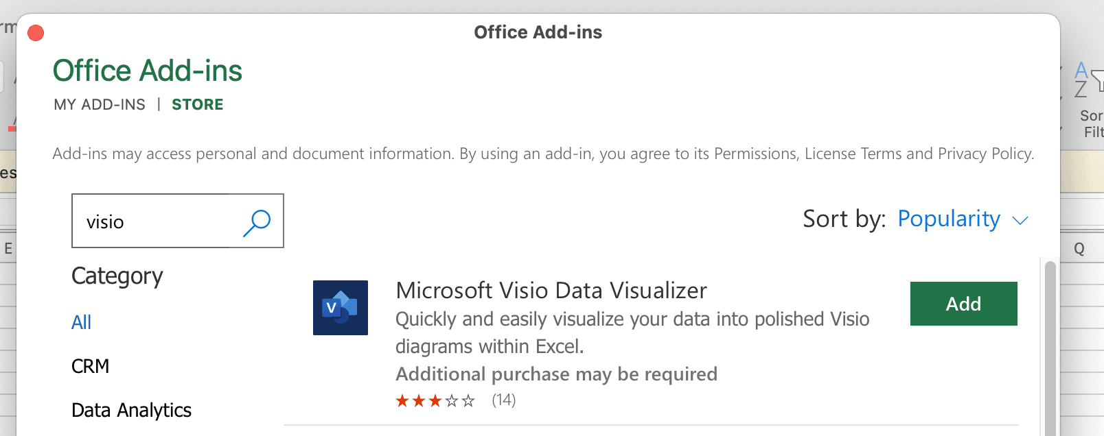
- Click "Get Add-ins" and search for "Microsoft Visio Data Visualizer"
- Install the add-in and sign in with your Microsoft account
2.2. Create Your First Org Chart
- Once installed, launch the add-in and select "Organization Chart"
- Choose "Quick Start" to begin with a template
- Excel will create a new workbook with an automatically generated sample org chart
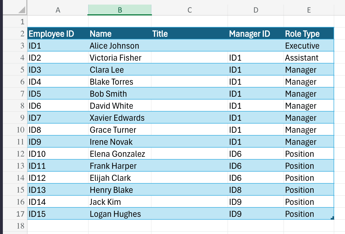
The workbook includes 5 essential columns:
- Employee ID: Unique identifier for each employee
- Name: Employee's full name
- Title: Job title or position
- Manager ID: Links to the Employee ID of their manager
- Role Type: Categorizes the position type
2.3. Customize Your Org Chart
- Replace the sample data with your organization's information
- Ensure each employee has a unique Employee ID
- Link positions by entering the correct Manager ID
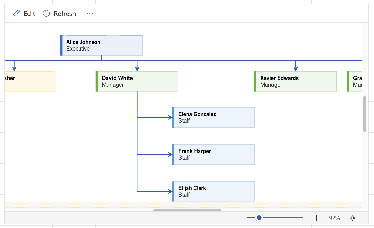
- Click the "Refresh" button in the add-in to update the visualization
- The chart will automatically reorganize based on your data structure
2.4. Download and Use Our Template
We've created a starter template that includes:
- Proper column formatting
- Base structure for your organization
- Sample data to demonstrate cell relationships
Get started quickly with our pre-designed Microsoft Excel org chart template (sheet 2 - Visio Add-in):
Download Template2.5. Export Your Org Chart
- Click the three dots (⋮) next to the Refresh button
- Select "Open in Web" to launch Visio web version
- In Visio web, click the three dots in the top right
- Choose your preferred export format:
- PDF for high-quality prints and sharing
- Image (PNG/JPG) for presentations and digital use
2.6. Understanding Limitations
The free Visio Data Visualizer add-in has some constraints:
- Supports up to 100 users
- Limited layout options
- Basic templates only
For larger organizations, Visio Plan 2 offers additional features:
- Advanced layout options
- Custom templates
- Unlimited users
- Integration with other Microsoft 365 apps
When to Consider Advanced Org Chart Solutions
While Microsoft Excel serves basic needs, several scenarios indicate it's time to upgrade:
Red Flags for Microsoft Excel Limitations
- Rapid Company Growth: More than 50 employees
- Complex Reporting Structures: Matrix or cross-functional teams
- Frequent Organizational Changes
- Integration with Communication Tools and HR Systems
Benefits of Specialized Org Chart Tools
- Automated Updates
- Interactive Visualization
- Advanced Reporting
- Integration Capabilities
- Scalable Design
Create org charts in minutes with Simple Org Chart
Build dynamic org charts that update automatically. Smart layouts and easy updates - without the limitations of traditional tools.
Best Practices for Effective Organizational Charts
Design Principles
-
Clarity is King
- Use clean, readable layouts
- Minimize visual clutter
- Maintain consistent formatting
-
Strategic Information Presentation
- Balance detail with high-level overview
- Use color coding strategically
- Include key metadata without overwhelming
-
Regular Maintenance
- Review and update quarterly
- Sync with communication tools or HR systems
- Reflect organizational changes promptly
Choosing the Right Tool
Your organizational chart is more than a document—it's a strategic communication tool. While Microsoft PowerPoint offers a solid starting point, growing businesses will inevitably need more sophisticated solutions.
Key Takeaways:
- Start simple with Excel for small teams
- Invest in advanced tools as you scale
- Prioritize clarity and accuracy
- View org charts as dynamic, living documents
Create org charts in minutes with Simple Org Chart
Build dynamic org charts that update automatically. Smart layouts and easy updates - without the limitations of traditional tools.
Looking for other ways to create your org chart?
Check out our step-by-step guides for popular applications.